Portfolio 2021 technical case study — Rendering a whole HTML website in WebGL
I’ve recently released my new portfolio designed by the awesome Gilles Tossoukpé. This was a great opportunity to illustrate what I was capable of using mostly my own vanilla Javascript open source tools.

The site heavily relies on a process that could be called “DOM to WebGL” (I also quite like the “DOM2GL” name) and I thought I might share some insights on how I did it.
https://www.martin-laxenaire.fr/
The journey
When a few years ago I discovered the power of WebGL and shaders, I instantly thought that one day, I’d really like to build a website fully rendered by WebGL. Yes, I do mean drawing every DOM elements of a website with WebGL : images of course, but also text blocks, links, buttons and so forth. Of course I wasn’t solely focusing on this, but I kept the idea in mind.
So in 2018, I started working on my own WebGL framework that could turn HTML images elements into textured planes, and after a few weeks of hard work I published the very first version of my library called curtains.js.
Over the years I kept improving it, adding some key functionalities such as videos and canvases based textures, Frame Buffer Objects and performance enhancements.
Rendering the text elements
In the end of 2020, as I had some free time on my schedule, I worked on the last piece of the puzzle that was missing: rendering multi line blocks of texts in WebGL.
I chosed to tackle this with canvas 2d context (and its measureText method) used as WebGL texture, as it was more suited to my own WebGL pipeline.
The overall idea was to create a canvas matching the size of each HTMLElement, get itstextContent and split it by words. Then I’d just have to measure each word before writing it to the canvas using thefillText() method. If there’s not enough space available to write that word, I’d create a new line before writing it and continue the process.
After a couple days of work, I had this working Javascript class:
(Addendum: while I was writing this case study and working on something else, I stumbled upon the Range API and specifically this Stack Overflow post. This could be another way to achieve the same result that might even be faster than the measureText() method.)
With that class I was able to quickly set up a prototype with all the text elements being drawn in WebGL.
To take advantage of this, I’ve asked Gilles to work on something mainly focused around types. I had the feeling that a portfolio with a strong typography design and rendered fully in WebGL hadn’t really been done as of today.
Scroll effect
To emphasize this idea I thought I could add a little effect that would make the users feel like they’re actually “dragging” the content while scrolling. All those planes are therefore rendered to a Frame Buffer Object (FBO, or render target). The output texture is then drawn onto a fullscreen quad with the desired post-processing effect applied.
Here is a live example of how this is working:
The fluid effect
During those past years I’ve also been experimenting a lot and I’ve came upon what is called Frame Buffer Object swapping (or FBO ping pong). This opened to me the doors to some super cool effects, including this ripple simulation:
Altho this kind of effect has already been used on websites before, I thought that I might find a way to spice it up a bit more, and apply it to my whole scene as well.
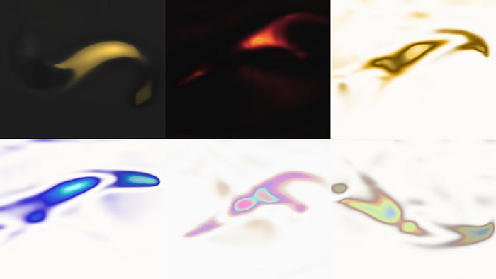
As you can see, finding the final look and feel of the fluid was a matter of many tests and discussions with Gilles:

In the end we’ve finally came up with some kind of shimmering fluid effect. It’s based on the CodePen seen above, but I’ve added a few extra calculations to alter the original “ripple” look and feel.
I’ve started by isolating the lights and shadows from the ripple effect.
Then the idea was to create 7 different areas for both lights and shadows, each one a bit smaller than the previous one, and apply a predefined color to each of those areas:
// ligths & shadows
float lightStrength = 5.0;
float lights = max(0.001, ripples.r - (0.7 + lightStrength * 0.025));
float shadow = max(0.001, 1.0 - (ripples.r + 0.5));

// get values to mix white and the colors for lights
// decrease lights area by multiplicating it with a float < 1
// then apply a pow() operation to sharpen the area
// finally multiply back the result with a big float number to increase the effect strength
float lightMixValue = clamp(pow(lights, 3.5) * 5.0, 0.0, 1.0);
float lightMixValue2 = clamp(pow(lights * 0.95, 5.0) * 10.0, 0.0, 1.0);
float lightMixValue3 = clamp(pow(lights * 0.9, 6.5) * 15.0, 0.0, 1.0);
float lightMixValue4 = clamp(pow(lights * 0.85, 7.0) * 30.0, 0.0, 1.0);
float lightMixValue5 = clamp(pow(lights * 0.8, 7.25) * 70.0, 0.0, 1.0);
float lightMixValue6 = clamp(pow(lights * 0.75, 8.5) * 100.0, 0.0, 1.0);
float lightMixValue7 = clamp(pow(lights * 0.7, 10.0) * 50.0, 0.0, 1.0);

// apply colors to lights
// [fluid1 ... fluid7] are predefined vec3 colors
vec3 lightColor = mix(color.rgb, fluid1, lightMixValue);
lightColor = mix(lightColor, fluid2, lightMixValue2);
lightColor = mix(lightColor, fluid3, lightMixValue3);
lightColor = mix(lightColor, fluid4, lightMixValue4);
lightColor = mix(lightColor, fluid5, lightMixValue5);
lightColor = mix(lightColor, fluid6, lightMixValue6);
lightColor = mix(lightColor, fluid7, lightMixValue7);// repeat for shadowsvec3 lightColor = mix(color.rgb, fluid1, lightMixValue);
lightColor = mix(lightColor, fluid2, lightMixValue2);
lightColor = mix(lightColor, fluid3, lightMixValue3);
lightColor = mix(lightColor, fluid4, lightMixValue4);
lightColor = mix(lightColor, fluid5, lightMixValue5);
lightColor = mix(lightColor, fluid6, lightMixValue6);
lightColor = mix(lightColor, fluid7, lightMixValue7);
Since at that point we were still looking for the right color combinations to use on the folio, I added some GUI controls so we could change the background and text colors, as well as the fluid color hue and saturation on the fly. This gaves us the opportunity to try out an infinite number of color schemes.

I’ve made a little CodePen of the final effect if you want to try it by yourself and look at the full code:
Rendering the scene and post-processing
Achieving the final result implied a few successive rendering steps and draw calls:
- Draw the FBO ping pong ripples.
- Use a first render target, where I’ll draw all the text elements that are not fixed so I could distort them on scroll.
- Draw the header text elements that should not be affected by the scroll effect.
- Finally, use a last render target pass where I’ll take all my scene elements (the background ripples and the foreground containing all the rendered
DOMelements) and mix them altogether to display the final result.
Luckily enough, this is relatively easy to setup with curtains.js.
Here’s is a basic example of what the Javascript part looks like:
Mixing two textures based on their alpha in GLSL
In my output fragment shader, I had to mix the foreground layer (all the texts, images, buttons and other elements contained in the DOM) with the background layer (the fluid effect) based on the foreground alpha value.
I’ve tried several ways to achieve it, including mix(), step() and smoothstep() operations, but in the end what gave the sharpest result was this snippet:
Page transitions
The last thing that I had to take care of was adding some nice animated page transitions.
Initially I thought I’d make the WebGL elements disappear with some fancy staggered animations while keeping the mouse trail fluid effect visible.
But I soon realised that adding +70 WebGL quads on each page load had a big impact on overall performance and was therefore blocking the main thread for a few hundred milliseconds. During this bottleneck, the mouse effect was annoyingly freezed. I definitely had to come up with something.
The trick was to use an additional overlay to cover the whole scene in my rendering fragment shader controlled by a uTransition uniform.
Here’s a breakdown of what happens during a page transition:
- show the overlay by animating the
uTransitionuniform from0to1. - do the heavy stuff: remove the current WebGL meshes and add the new ones. There are still some frame drops but you can’t see them since the overlay is covering the whole scene!
- hide the overlay by animating back the
uTransitionuniform from1to0.
The GLSL code for the overlay is pretty straigthforward, it consists basically on drawing a rectangle distorted by sinusoidal functions based on theuTransition uniform value. 4 overlays are drawn on top of each others, matching the fluid effect colors and using pow() to tamper the original uTransition value.
You can have a look at how it’s working on this CodePen by playing with the transition input:
Wrapping it up
Now that everything was in place, I just had to actually build the actual portfolio.
Workflow
As the content wasn’t going to change much over the time, I’ve decided not to use any CMS. I used plain old HTML, CSS, and ES6 Javascript. The build files were generated by esbuild which is super fast and easy to set up.
Besides curtains.js, I’ve also used a few other utility libraries I’ve built myself over the years:
- PJAX router: AJAX navigation that allows animated transitions between routes.
- Native smooth scroll: A non obtrusive smooth scroll library that eases the scroll values while keeping the native scrollbar and keyboard navigation features.
- Scroll Observer: Detects when elements enter or leave the viewport based on the Intersection Observer API and triggers according callbacks.
Finally all the animations were powered by Greensock’s GSAP library.
Of course, the portfolio also features WebGL images and videos, a bit of parallax, some scroll and mouseover triggered animations. I won’t cover these here since you’ll find all you need to build that in the above various libraries documentations.
Performance and accessibility
When it comes to WebGL, performance and accessibility are always two major concerns.
I’ve decided to make three versions of the folio:
one that uses the full WebGL layer animations, one that delivers a lighter version without WebGL but with a few animations and page transitions, and one that displays the raw HTML/CSS content as is.
Based on a code snippet from the talented Baptiste Briel, I’m choosing which version to ship based on a little CPU performance check and whether the user has activated the reduce motion setting at the very beginning of my app:
In order to respect the accessibility standards, I’ve ensured that the whole website is accessible while using the keyboard to navigate and that the focused clickable elements are correctly highlighted.
Conclusion
I hope that this case study helped you understand how I’ve been able to render every HTML DOM elements of a website with WebGL.
If you have any question or would like to discuss about it, feel free to contact me:
